Tuesday, 11 October 2016

Prototyping & Design Resources

I was working on the prototype of our app last week, and you can play around with it here: https://marvelapp.com/21912gd. I'll be sharing my tools and process below.

I mostly stick to Google's Material Design as I find it neat and logical. There are also usually Material Design libraries available for most frontend libraries/frameworks.

Angular Material (Angular): https://material.angularjs.org/latest/
Material UI (React): http://www.material-ui.com/#/

Wireframes

Firstly, I come up with wireframes on paper. I just draw rectangles freehand and then sketch out how pages should look like. This should be a quick process that takes maybe 30 mins.

Wireframes

I also add notes in another colour to show what page you move to when you press on buttons, etc.

You can see that I followed Material Design in the mockups, and being familiar with the design style helped me to quickly layout the components. The layouts may look familiar as I used Youtube's Android app and Telegram as references. Don't be afraid to copy good design. :P

Mockups

Next, I create the hi-fidelity mockups using a design kit and Photoshop.

There are quite a few free UI kits available out there, but I'll link some of them here.

This is the one I used for my prototype, Material Design kit from UI8:
https://ui8.net/products/free-material-ui-kit

Invision has quite a few free UI kits, which are also available in Sketch, and they're all beautiful.

Do: https://www.invisionapp.com/do
Now: https://www.invisionapp.com/now
Tethr: https://www.invisionapp.com/tethr

I usually use Photoshop for this step. If you're not familiar with Photoshop, you can use some other tool to design the mockups, like Balsamiq, which gives you a drag-and-drag interface. Unfortunately, I found that most mockup design programs only have free trial versions, and you have to pay after x days or pay to unlock the edit function. So sticking to using the free design kits might be the best choice.

Mockup of main app screen
Mockup of profile page

Adding Interactions

Usually, I stop at either the wireframes or mockup stage for building school projects. However, it might be useful to create a more interactive prototype for users to test out the interactions. This might come in handy for collecting user feedback.

For this, there are quite a few apps out there that let you do so with amazing features... However, most of them are paid. I'm a poor student so I stick to using Marvel.

Marvel is basically a glorified Powerpoint that allows you to add animations and interaction areas to bring your static mockups to life. It also allows you to display your prototype on your Android or iOS phone so that it looks more real to your user.

I put together my static mockups in Marvel and added interaction areas to the buttons so that the pages transition when I press on the buttons, as if it's a real app. Here's my prototype: https://marvelapp.com/21912gd.

You Can Do Design

My groupmates in CS3216 from various groups so far were quite amazed when I managed to sketch out wireframes quickly and bring together everyone's ideas of the app. I got the impression that they feel design is too hard, or that they need to have some sort of talent for it. However, like most skills, it can be learned.

It takes a bit of practice to get familiar with the process, but design skills can be learned and polished with experience. I first learned ui design in poly 6 years ago, and have been practising it on and off all this time to get to this level. It's not something that I knew right away or picked up very quickly, but it's doable.

Hope this post helps you in planning and designing your apps somehow. :)


Friday, 30 September 2016

Week 7: Starting the Final Project

Idea Generation


My team kept generating ideas since the weekend, but we couldn't really decide on one.

Some ideas we had were:
- Drag & drop travel planner
   > We usually need to open lots of tabs, apps, to plan one trip -> we want a one-stop solution.

- Anonymous chat where you can reveal your identity
   > Main purpose: make friends once you get familiar
   > Try to get people to reveal their identities

- Location-based social map
   > Something like Habbo Hotel but you get to see users around your location
   > Create your own sprite

Idea Validation: Travel Planner

On Monday, we asked Colin about the first 2 ideas, and he like the travel planner idea. He had felt the same pain we did when planning your own trips.

On Tuesday, we gathered feedback from some of our tutors and realised the tutors felt that the travel planner app would not be a good idea for the final project.

Some reasons they gave were:
1. Scope too big
2. Too many travel apps

I really liked the travel planner idea as I like to plan my own vacations, and I don't usually travel with packaged tours. I would love to have an app like this to solve the pain of having to open Google Maps, Google Docs, Google Sheets and TripAdvisor to plan one trip.

However, I saw their point in that the scope was really too big. During group discussions and user validation, we realised that both us and the users would want a wide range of features in order to make this app a one-stop solution. Within the 5-6 weeks we have to build this final project, it was probably not feasible. Or we would only build a half-baked app in the end. Even if we die trying.

Another Idea: Anonymous Chat

We did a quick poll amongst the team and found that we weren't too convinced about the travel app idea now. After another brainstorming idea, we expanded on the anonymous chat idea and combined it with one of the social causes we had interest in.

We wanted to have a platform where users can find someone to talk to about problems or emotions. We also wanted to make it easy for people to join in, without accounts, and anonymously.

Introducing Bubble

We proposed to have an anonymous chat platform where users could create private one-to-one or public group chats. In the group chats, anyone can join and they can set the topic beforehand. In private chats, they can indicate interests and find a random match to chat with.

However, there are some problems we might face...

- Anonymity => bullying?

As with other anonymous apps, Bubble can be used to bully people, and considering that we're targeting those who have emotional problems, bullies might end up kicking someone who is already down.

We intend to moderate chats and allow people to flag users that act inappropriately.

- Not enough users 

As a chat platform, Bubble needs users to actually chat with.

Following the growth hack talk, we intend to fake it until we make it, going the way of Reddit.

After some googling, I also found a Reddit thread that shows how Dropbox, Quora and Foursquare growth hacked at their start. It shows pretty interesting strategies, and hopefully we'll be able to try them out for our final project.

https://www.reddit.com/r/Entrepreneur/comments/2clqa3/how_startups_such_as_dropbox_airbnb_groupon_and/

Some Thoughts

As usual, I'll be acting as the designer and frontend dev. After playing around with React in Assignment 3, I'll most likely be returning to Angular and Angular Material for the final project, to play to my strengths and something more familiar to me. After going through the talk on security, I also picked up some tips and will be (hopefully) making it so that the frontend doesn't suffer from XSS. :P

I'm pretty tired after going through midterms this week, but hopefully I can start kicking things off over the weekend!

Tuesday, 13 September 2016

Anxiety, Jadeye, Rehashing Ideas

Kudos to all those who presented just now!! It takes courage to go up in front of a crowd and present your idea, then open yourself up for constructive criticism.

So it was a really long and tiring night... but there were some interesting ideas presented. There weren't really any that I believed in enough to work on for the final assignment, but I did see merit in some of the ideas.

My Anxiety and Jadeye


For example, Jadeye.

I've had bouts of anxiety due to stress before, and it was a problem that I felt was too trivial to specially go to a psychiatrist or counsellor for, and yet was affecting me physically and mentally: insomnia, panic attacks at night. I tried an app called Pacifica to calm myself down, and it offered similar features to what Jadeye proposed, with journaling and calm breathing exercises in the app.

The unique feature that Jadeye provides would be the ability to contact a certified therapist. Contacting a therapist over an app does feel much more convenient than going to the hospital or a private practice. I might have used it, but I am quite price-sensitive as a student with limited budget.

However, it remains to be seen how much it can actually help the people it is trying to reach. For me and Pacifica, the journaling feature was too much of a hassle eventually, and just typing to myself wasn't helping much. In the end, it was talking to a friend and taking a breather to come to terms with my own state of mind that solved my anxiety.

Rehashing Existing Ideas


As with most pitch events I have attended, there are always one or two ideas that are rehashes of something someone has built before. The thing with these ideas is that the pitcher might not know of the product that had come prior, but someone eventually brings it up and explains the downfall/success of the existing product and asks how the pitcher can do better than before.

You can't just dismiss or ignore the similar products that have walked this road before. On one hand, you can learn from them, see what they did wrong, and then improve over that. On the other hand, you might see what happened to them and realise that this road might lead to a dead end due to factors out of our control.

For the proposed anonymous Facebook messenger, one of its prominent predecessors was Secret. It had the same basis of being an anonymised platform comprised of only people you know. After a quick Google search, you can find that it eventually closed down due to malicious comments, racism, etc. Basically anonymity brings out the asshole in people. Who knew?

I felt quite sympathetic to the pitcher because of all the negative feedback he received. I've also had an idea that had already been implemented by others. In a nutshell, making it easy to order food in a group. My idea was similar to Orderlyst, which had been created by one of our tutors, Sam Yong, previously. I happened to ask him for feedback without knowing that he had created Orderlyst, and he candidly shared with me what happened when they made Orderlyst. Basically it didn't go well.

I've personally tried implementing my idea and testing it in my internship company. I did two different versions: a Slack bot and a Meteor web app. I iterated on them based on feedback from the users in the company, who used it to order lunch. While they were open to trying it out, they needed lots of prodding to actually use it. Eventually they just reverted back to doing a copy-paste of the list of orders.

My enthusiasm was quite dampened by the experience, I kept wondering, hmm I thought I already made it as easy to use as possible, why are they still doing copy-paste? In the end, the answer is probably: copy-pasting is faster and easier.

Sam faced the same issue, if I remember correctly.

I have still been turning this idea around in my head, considering it from different angles, but I haven't actually tried to implement it again. In the end, it doesn't feel like anything could be easier than copy-pasting. If anyone does manage to think of something, do try it out and let me know if I can join you. :P

So my point is: some pains may not be able to be solved, because the existing painful solution... is actually already the least painful. Hum.

Your thoughts on this, guys?


Thursday, 8 September 2016

Week 5: External Pitching & Assignment 3 Idea

I thought the ideas pitched to us were interesting. For the INTELLLEX idea, I've actually heard of how painful legal search engines were to use when I was taking Information Retrieval. As for the idea for reaching out to depressed people within NUS, while it had good intentions, it was still a little underdeveloped and felt a bit shaky to implement.

The idea that made me take notice was the treatsure idea of giving away food that is going to be thrown away. You can tell that food waste is slowly gaining publicity as a problem society needs to solve.

 I remember watching a video where fresh produce that doesn't have the normal shapes that we expect, get thrown out and go to waste. However, a startup called Imperfect Produce is taking the produce that grocery stores don't want to sell and packaging it to consumers (https://www.youtube.com/watch?v=Gi4iSrdlOXk).  There was also a woman in India who placed leftovers in a fridge outside her restaurant for anyone to take: http://www.upworthy.com/a-woman-saw-hungry-people-digging-in-her-restaurants-trash-so-she-put-a-fridge-outside .

Just by googling 'food waste startup', I managed to find an article on TEN food waste startups (https://foodtechconnect.com/2015/10/09/10-startups-reducing-food-waste-one-byte-at-a-time/). I didn't even realise there were that many food waste startups out there, or how many people were trying to solve this problem.

I had one thought: 'What if they combine forces instead of spreading out their resources like this?' but I don't think it's feasible considering how logistics-heavy the solutions need to be, and how localised it has to be. So the treatsure idea sounds like it could make a foothold in Singapore.

Although the external ideas were enticing, my group already decided on building a solution for a problem close to our hearts: finding a common time for meetings with group mates. We already feel the need for our app as we tried to set up a meeting time between the 4 of us -- our timetables just clash. XD

We're going to build a mobile interface for NUSMods and allow people to build their timetables as well as easily match free times with their group mates. For this assignment, I'll be working on the frontend together with Nicholette. We're going to learn React and try it out for the first time. I do like learning new things, and React has been something on the list to learn for some time, after Angular.

Learning from assignment 1, I drew out the user interactions and prioritised mobile first. I then drew out all the wireframes, so that it would be easier for me and Nicholette to work together on the UI. Looking forward to learning building something that people will use in the future!

Monday, 29 August 2016

Evaluation: Paper & Pencil

I had never seen nor heard of Paper before Group 9's presentation, but I was amazed by the beautiful UI. From looking at the animated gifs, I could tell that the interaction was intuitive, and I'm starting to feel that the current interactions I have with my mobile device are too rigid.

I think there is a lot to learn from Paper as it is now and how it has evolved over the years, especially the changes it has made. Here are some points I thought pertinent to building a good product:

1. Make full use of your platform


> Paper was made by thinking of tactile feedback first. 
Extracted from Group 9's presentation slides

Their touch-based user interactions make sense since they built Paper for mobile devices, where touch is how people interact with apps. Conversely, if they placed Paper on a non-touch desktop interface, then the interactions would be much more tedious when performed with a mouse. I think we should always consider the platforms that we are building on and play to its strengths.

This may seem intuitive, but I don't think most people consider this when building apps. When building mobile apps, people tend to squeeze views that were originally on a wide desktop view into a tiny mobile screen- resulting in slide out menus, bottom action sheets, floating buttons, etc. Rather than overwhelming users with a cluttered UI and actions hidden in various places, I believe using gestures would be more intuitive and clean for mobile apps.

2. Don't be afraid to change


> Paper started out in 2012 as a drawing app. It has since transitioned into a productivity app. Its original 5 drawing tools have morphed into 3 main productivity features: Sketches, Notes, Photos.


Extracted from Group 9's presentation slides


Paper started out catering to artists before constantly changing their features and business model and eventually becoming a productivity app. They did not stagnate and continued to think of improving their app, and thereafter reached a wider audience with their app.

I think most people are usually scared of making big changes and taking risks. Although it is not guaranteed that things will turn out well, as it did for Paper, at the heart of software development, we are trying to make a difference. As such, we should not be content with what we have built and constantly seek to improve our app, even to the point of pivoting and changing our target audience in order to impact more people.

3. Funding your product


> Paper used to have a freemium business model, but has since changed to become totally free.
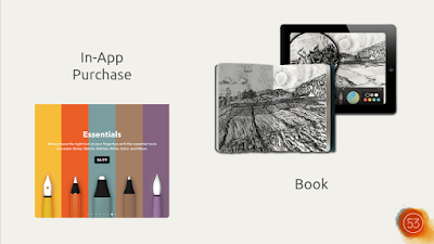
Extracted from Group 9's presentation slides

This seems to be due to their other product and current main revenue stream: Pencil. Pencil is a stylus that pairs well with Paper. Pencil also has an SDK so that other apps can provide support for Pencil, and there is now a large ecosystem of apps that support Pencil.

This seems counter-intuitive at first. Allowing Paper's competitors to use Pencil in their apps seems like it would detract from having Pencil support as a unique feature for Paper. However, it makes better sense to have Pencil sales as a revenue stream to continue support for Paper.

They also tried having a printing service for artwork created by Paper, which was a fresh and interesting idea- and most importantly, targeted their niche market.

We can learn from what they have done, in terms of experimenting with new products that complement your existing ones, as well as interesting services that serve your target audience.

Some thoughts...

> Build products for people

Through the first few years of working on assignments for modules, I got used to seeing applications as a collection of tech features that I have to build. However, after going through an internship and learning the processes of building products instead of just applications, I started to realise that the applications we are building are meant for people to use. In that sense, user experience is a tremendously important part of product development.

As developers, I think we tend to think of tech features first, and design later. This is fine in school, where all we have to deal with is assignments we hand up for grades. However, as we enter the industry as developers working on products people use, I believe we should all have basic knowledge of the UI and UX design processes, or at the very least, an understanding of why they are so important.

In that sense, Paper provides an excellent example of how giving equal emphasis to design can make a wonderful product. With their team being a 50/50 split of coders and designers, I don't see how they can work well together without having an understanding of how each department works.

> Don't be scared

It might be scary to think of learning how to design.

As someone with design experience who gets forced to act as a designer when working on teams of 100% developers most of the time, I realise most people feel that you need to have a talent for design to be good at design and get scared off actually trying out designing- but this isn't true. The knack for design can be learned, if you put enough effort into it. Just copying good design and applying common sense can already create a better user experience in your applications.

> Be sticky

After building our fantastic apps, we still need users to actually make them useful to the world. I think Paper does it well by integrating social media platforms, then going one step further by creating a community with a unique experience to make it sticky. We can consider following suit and using social media channels to funnel in users, then keeping them there with our app's unique features.

> The presentation

I think the presentation on Paper & Pencil put too much focus on introducing the products, and they could have provided a little more insight into how 53 iterates on its products and how they find their product fit. However, it was understandable considering how little time we all had for our presentations. The overview that Yijiang and Jinghan gave interested me enough to research more into Paper and how they actually make money for a free app.

> The assignment

This assignment was pretty interesting, and I learned more about 10 different apps in just 2 hours. I think everyone did well in condensing all the information into digestible pieces, especially considering the time limit that we had.

I learned about different types of apps, how they broke into their markets, and potential ideas to take their products further. I also learned about different technology stacks- including ones I had never heard about. All in all, it was an intense but fun night of listening to people present. The Pecha Kucha format does help to keep presentations at a good pace so that we don't die of boredom.

This critique also helped me to gather my thoughts and get my brain juices flowing to type out a good evaluation of an app, as well as think of insights into software development. I hardly get the chance to do this, nor would I normally think of doing this, so it was an interesting foray into using my brain for deeper thoughts.

10/10 would do again


Tuesday, 23 August 2016

Pivot, Growth Hacking & Ideation

We had a group meeting on Mon where we found out that we had vastly different ideas of how our product would be like. This was a bit of a shock since we had been on the same page and working towards the same MVP for the mid-assignment submission. However, it turns out that our product manager had been trying to find an angle where our product could bring more value to our users, and that he had a different vision from us.

After some elaboration, we all agreed that his vision would really bring more value to our users, and that we all wanted to go ahead with his idea. We considered the remaining time we had, and decided to try it out.

Firstly, we had to get everyone on the same page again. We took some time to sketch what each of us thought how our product would function and look like. Our mental images turned out almost identical, albeit for some extra features here and there. We then looked at the features we had to churn out: the must-haves and nice-to-haves.

After that, I came up with storyboards and layouts for the new design of the website and got everyone to agree on it. Based on our schedule, I think we can still make it, and we are all happier to create a more useful product. We also learned a lesson to always check if everyone has the same vision, and that we should bring up ideas as and when they occur to us, rather than waiting to a later date and missing out on opportunity.

---

We had two interesting talks for our lecture after that: growth hacking and ideation.

I had never heard of growth hacking before Bjorn Lee's talk, but it sounds like a very interesting strategy to try out. I thought that the tips he gave made sense, and it seemed like he had a lot of experience. In particular, the part about posting Google ads to find a connection was funny and provided a great example of thinking out of the box and making use of the tools at hand.

When prof introduced Chris Cai to us, I was anticipating some first-hand examples of godly iOS programming. But alas, it was a talk about ideation. It was pretty much the same as all the previous lectures on ideation I had been to, but I think he executed it quite well.

Sunday, 14 August 2016

First Lecture & Saturday Workshop

After going through the first lecture, CS3216 seems to be what I was expecting, in terms of what we are going to learn and in terms of the pace and workload. My group was formed on the first day and we were already meeting and brainstorming on the second day.

After my group looked through the Facebook Graph API, we realised our chosen idea would be severely limited by permissions required from users, so we had to rethink and try to change the angle of our idea to make use of the limited data we had access to. I didn't realise that the Facebook API had become so restrictive, but I could understand why from a user's point of view. However, it feels extremely restrictive as a developer trying to bring value to an app user, as there is not much data we can access. Facebook, on the other hand, still has access to all that data and can build apps with it. Hmmm...

Anyway, we managed to get feedback from our tutors and decided to go ahead with our idea.

I also attended the workshop on Saturday. I thought Prof. Damith had a point about tech people not giving very good presentations in general. His tips were interesting and not something I had heard of previously. Following that, our tutor Sam's tutorial on setting up a AWS server went smoothly for me. It was quite easy to follow.

Also the pizza was really good. :D

Looking forward to finally attending a lecture by the famous Prof Ben later today. O: